Laura Bligh interviewed graphic designer Eileen White in October, 2000.
INTRODUCTION:
Eileen White designed the cover and booklet for the recent album TIME AFTER TIME and the original booklet for EVA BY HEART. In this interview, she discusses how she approached the project and how she turned detective from basement to attic to track down some of the photos and artwork. Get out your CD and take a look while you read!
Question: How did you get involved in this project?
Eileen White: Blix Street Records had originally planned to do the artwork for the TIME AFTER TIME album themselves, and they had a concept already in mind. But Chris Biondo [Eva’s producer] wanted me to design the album because I had worked with him on the original EVA BY HEART.
I had to put a comp together quickly to get it in for consideration, so I did the initial design in a weekend. It changed some after that but I did the basic thing in a weekend. I printed it out and made a mock-up of the package, and sent it to Blix Street. Fortunately, they loved it, and the Cassidys loved it, so they asked me to do the project for them.
Question: Tell me about the cover photo on TIME AFTER TIME.
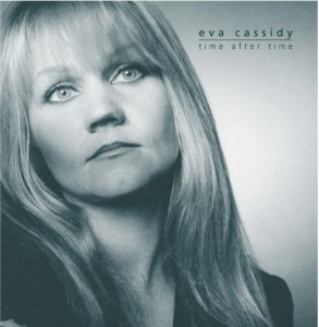
Eileen White: For the cover, I wanted to find something new that hadn’t been seen before. There are so few pictures of Eva and most of them had been used already. So I went over to the Cassidys and spent an afternoon with Hugh and Barbara, Eva’s parents. Barbara gave me an envelope of photos to go through. She is the sweetest person, by the way, she had me stay for dinner and treated me like family.
I picked out a few that I thought I could use for the package. There was one that I had never seen before, I thought it was really nice. I recognized it as being from a photo shoot that had been done years before. Chris had some small prints from that shoot, and I recognized from what Eva was wearing that it was part of the same sitting. It was a black suit with a short black skirt and a black top with black lace sleeves, and it was so un-her, not the way she normally dressed. But the picture was a pretty shot of her face and a good quality 8×10, so that was what I initially started with as a cover photo. I liked the photo, Chris liked the photo, but Blix Street didn’t like it. But I figured there had to be more photos from that shoot and maybe we could find something else.
The photos Chris had were “test Polaroids” that photographers take before they do the real photos. The question was, who took those pictures? No one could remember who the photographer was. I asked Chris, I asked Al Dale [Eva’s manager], nobody could remember, all Chris knew was that it was a guy in Baltimore. Finally Chris told me “I wrote a check for those pictures,” so I said great, all we have to do is find the cancelled check, which would have been fine except that Chris’s record-keeping was never a very organized thing. But I thought I’d give it a shot since it was the only lead I had. So I went up in the attic where his papers were stored and rummaged in all his old papers from that time period, because he remembered about when the photos were taken. Anytime I saw a name that could remotely be a photographer I’d ask him about it. I knew about how much money the check should be, so that helped. Finally I found a check to someone named Norman Watkins, and asked Chris, “Is this it,” and amazingly it was, we’d gotten lucky and found it. Now we had the name, and thanks to the Internet, all we had to do was use a people-finder to track him down. We found Norman Watkins Photography and I knew we had struck gold.

Chris called the guy and he remembered Eva, he remembered the photo session, and he sent us contact sheets of all the pictures he had taken that day. There were a lot of nice photos on there, and I took a couple of the better ones and scanned them and tried them in the layout. But the one that Blix Street liked best, that they ended up wanting to use, was one of the little “test Polaroids” that Chris had. It had been in a drawer for years, it was all scratched up, it had stains on it. I did a lot of work to that photo to clean it up so it would be usable. Because it’s a Polaroid there’s no negative.
[The photo to the left is another from that session with Norman Watkins, who kindly gave permission for its use to illustrate this interview.]
Question: How do you “clean it up”?
Eileen White: I had it professionally scanned to get the best possible image, then digitally retouched it. I had to take out all the scratches and stains and bumps. That’s why the photo looks a little soft, it was small to start out with, the original was maybe three inches high. So that’s the story of where the cover photo came from.
Question: Tell me where some of the other images came from.
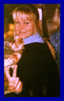
Eileen White: Most of the photos were things the Cassidys had. One is with Eva in front of a fireplace doing these interesting hand gestures. I have no idea what she’s doing there but I really like how it looks. That photo was taken by Eva’s friend Larry Melton, it has a sort of magical feel to it. Another picture I got from the Cassidys is the one of Eva making the peace sign. That one I wanted to use because Hugh Cassidy said it was one of his favorites. The original of that was pretty fuzzy and grainy, so I did what I could to touch it up.
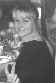
[The color photo at the right, or above, is a scan of the original Polaroid of the “peace sign” photo, before retouching. To the left, the “cleaned-up” version that was used with the CD booklet. Eva’s sister Margret took the snapshot at a family Thanksgiving dinner.]
The other two photos have a color effect on them to make them a little more interesting. The one of Eva on her bike, that has an unusual story. A couple of years after Eva died I was helping Chris clean some things out of his basement. He had an old desk down there, and it was packed with all kinds of old papers, in total disarray, and at the bottom of one of the drawers were a couple of rolls of undeveloped film. So I got the film developed, and on one of the rolls were some pictures of Eva and her friend Elaine on a bike trip that they took, I don’t know where or when. The picture of Eva and her bike is from that trip.
The photo of Eva standing by the river, on the inside of the tray card under the disc, is one that Barbara Cassidy picked out. She said the original color version reminded her of an impressionist painting. It was a lucky accident how well it worked in the layout, the way the branches of the trees met right in the center, the way the tree on the left side went up the spine of the album. It wasn’t until later that any of us thought about how it was like Eva was standing “By a Brookside.” Initially Blix Street was a little concerned that Eva looked too heavy in that photo because you couldn’t really tell that she had a coat tied around her waist by the arms. So I touched the photo up and trimmed off the lump that was caused by the arms of the coat, and then they were happy with it. I didn’t think it looked bad, but then I knew what she looked like and if you didn’t know, you might have thought it made her look heavy, which she wasn’t.
Question: What about Eva’s artwork that is reproduced in the album booklet?
Eileen White: They were things that Chris had in his collection of things Eva had made or drawn. For example, the mermaid was a little watercolor sketch that Eva had done very casually. I don’t think it was anything real important to her, just kind of thrown in a box, but I really liked the way it worked with the other photo of her by the fireplace. Eva’s facing one way doing this thing with her hands and the mermaid is facing her doing something with her hands, I liked the way the two images worked together. I don’t know if Eva had intended the mermaid to be a sort of image of herself but that’s how I saw it when I worked on it. Eva loved the water.
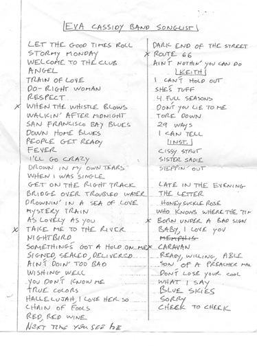
A few of the other things, I found in the same desk full of papers from Chris Biondo’s basement. The band song list which is used on the panel behind the credits, that was a handwritten sheet of paper where Eva wrote the list of the songs that the Eva Cassidy Band performed. I put it behind things so that it wasn’t a major focus but if people were interested they could read between the lines and see some of the songs the band played.
The other thing in the desk was the “Springtime” poem. I took an excerpt from it but also used an image of the handwritten poem. I thought it would be nice to show it in her original handwriting, especially with the drawing at the bottom where she drew herself as a bee. I really loved that poem, it showed a lot about Eva, not only her love of nature but the innocence that she had, how she could find happiness in really simple things.
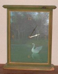
Question: What about the clock face?
Eileen White: That’s an actual clock that Eva made for Chris Biondo. Eva made a lot of stuff for Chris, she made him a beautiful coffee table, all hand painted, quite remarkable. Anyone going into his house immediately wants to know about that table. The clock is painted in oils on wood, and it’s an actual working clock. It’s very dark and dream-like, pretty much like it’s reproduced here. I thought it would be a nice image to use for an album called TIME AFTER TIME, and to reproduce it I just put the whole clock right on the scanner and scanned it hands and all. It appears twice, with the hands in different positions, but there’s no significance to the time.
Question: What about the design of the CD itself?
Eileen White: Initially when I was working on the layout for the disc I wanted it to look very balanced to give it a quiet feel, but I wasn’t sure how to do it with the amount of information I had to put on there. So just for fun to see how it would look, I took the type and flipped it over and put it on the other side, like a mirror image or a reflection. I liked the way it looked, it said something about the forward and backward nature of time that went with the title of the album. Initially Blix Street thought it would be confusing for people but they liked the concept so they decided to keep it. The tree on the disc is from the clock. It’s hard to tell what it is on the US version, it’s clearer on the UK version.
Question: What else did you have to consider when putting together the “package”?
Eileen White: I went with an overall green layout for a couple of reasons, number one was that Barbara Cassidy had told me that blue and green were Eva’s favorite colors. And because I wanted it to have a quiet sort of feel of the woods and of water, because Eva loved the woods and the water so much. I wanted it to have a calming, peaceful effect.
Question: Chris Biondo tells me that you were somewhat involved in the selection of one of the songs on the CD.
Eileen White: Not really. There were a couple of songs on the original song list for TIME AFTER TIME that had some problems, and Blix Street started considering alternatives. In the meantime I had been listening to a tape of some songs that Eva had been working on, that she used to listen to in her car. I heard “I Wandered by a Brookside” and fell in love with it. I thought it was one of the most incredible vocals I had ever heard. What I really liked about that song was that it was so simple, so pretty. It sounded like someone singing quietly to herself, just something she might be singing to herself while she was painting, especially the part where she hums. I told Chris Biondo how much I liked that song, so when Chris heard that Blix was considering other songs to put on the record he suggested Brookside because I liked it so much, and they used it.
Question: How did you happen to know Eva Cassidy?
Eileen White: I met Eva through Chris Biondo shortly before she got sick. Unfortunately I never got to know her well, so most of what I know about her comes from other people. The first time I heard her sing was at Borders at White Flint Mall. I knew Chris Biondo’s father from my community association, we work together on the community newsletter. He had told me that his son was performing there, he wanted me to meet his son, so I went. I met Eva and Chris there, and not long after that I saw her and Chuck Brown at Blues Alley, when Eva’s hip was first starting to bother her.
One thing I’ll never forget, maybe Eva’s fans in Australia would like to hear this story. When Eva was sick, Chris and I took her out on a shopping trip, we pushed her in a wheelchair because she couldn’t walk very well. In the van on the way home, Chris said to her, “Sing ‘Waltzing Matilda,'” and she did. She sang it real quietly as we were driving along, and I was rapt. She made it sound like the most beautifully bittersweet love song you ever heard. That was when I realized what a truly incredible voice she had. She could take anything, any song, and make it special.
Question: I gather that designing album covers isn’t normally your thing?
Eileen White: It’s not what I do full-time, but I do a lot of CD packages as a freelance designer. One of the first ones I ever did was the original EVA BY HEART, which is different from the one that’s out now, by the way. The original was a 12-page book, now it’s a foldout like TIME AFTER TIME.
Question: Why was it changed?
Eileen White: The original version included some really good photos of Eva that were taken by a local photographer. When we were working on EVA BY HEART it wasn’t long after Eva died, and the photographer was sympathetic to what we were doing and let us use his photos for free. But a couple of years later, when Blix Street went to re-release the record on their own label, the photographer felt he should be paid royalties and they were unable to reach an agreement. So the layout had to be redesigned. It’s a shame because they were great pictures.
Question: I suppose the original release will become a collector’s item. You also designed the promotional poster for EVA BY HEART.
Eileen White: Yes, I did the poster which is on your website.
Question: Eileen, thank you very much for your time.
Note: To read another interview with Eileen White, from 2003, click here. Eileen discusses the “buried treasure” that became the design of the album AMERICAN TUNE.
Copyright 2000 by Laura Bligh and Eileen White. If you would like to use sections of this interview for an article about
Eva, please ask for permission.